UX Motion Study
Vibe App is a personal UX motion case study developed as part of a School of Motion course.
This project explores how motion can improve engagement and usability in a music streaming app, with a focus on song selection and playback transitions. The objective was to reinforce user mental models, provide clear feedback between states, and maintain spatial continuity throughout the interaction flow.
• Role – UX Motion Designer
Owned interaction motion, pattern research, prototyping, and implementation-ready specs.
• Tools – After Effects, Figma, Lottie
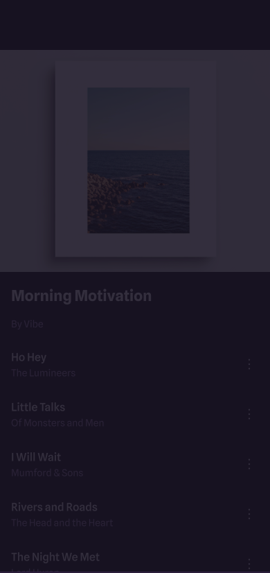
Problem
User data indicated low engagement with song playback, alongside recurring feedback that the app experience felt static.
Key issues:
• Abrupt jump cuts provide no visual feedback when users select a song.
• Lack of spatial continuity makes it unclear how the Now Playing view relates to the Playlist.
• Sudden state changes increase cognitive effort and reduce confidence in navigation.
Goals
• Provide clear feedback when entering and exiting the Now Playing state.
• Preserve spatial continuity between Playlist and Now Playing views to keep users oriented.
• Design playback transitions to feel responsive and deliberate, encouraging continued interaction.
Audible
Spotify
YouTube
Interaction Pattern Audit
To support these goals, I reviewed playback interactions across leading audio products to identify established motion patterns that reinforce user mental models.
Common implementations preserve spatial continuity through container-style transitions that visually connect related states. This approach reduces the sense of abrupt change and helps users understand their position within the interface and how to navigate back.
Material motion research further supports this pattern, showing that container transforms reduce cognitive disruption by maintaining spatial context across states, which helps users stay oriented and confident as they continue interacting.
Key Motion Decisions
• Restraint over style
Stylized motion was intentionally avoided to preserve clarity, ensure responsive feedback, and build user confidence during playback.
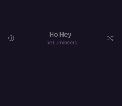
• Spatial continuity via container transitions
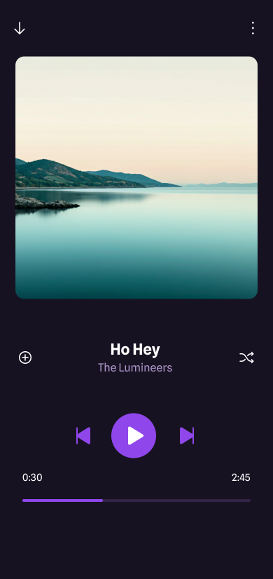
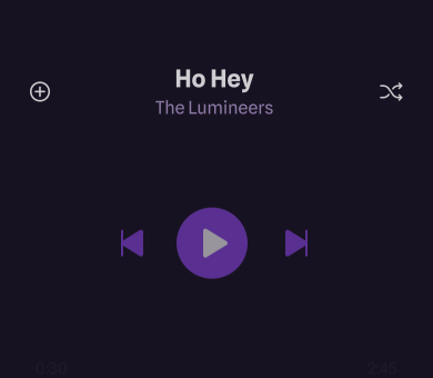
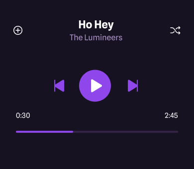
The mini player container expands into the Now Playing view using shared elements, preserving spatial continuity between states. The downward-facing back button signals that returning reverses the same transition.

• Visual noise reduction through background fades
The Playlist background fades out to reduce visual noise and clarify the transition between states. Staggering fade timings avoids overlapping transparency, preventing cluttered or distracting intermediate frames.
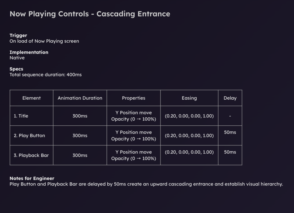
• Cognitive load reduction through cascading entry
Playback controls enter with a subtle cascade to guide attention and support visual hierarchy. This staged reveal reduces cognitive load and allows the user’s eye to follow the transition, rather than processing multiple elements at once.
• Consistency as a motion system
Motion direction and easing curves remain consistent across transitions to create a predictable and cohesive motion language. Repeated use of the same transition logic reinforces familiarity and improves overall usability.
Outcome
• Clear visual feedback confirms playback actions.
• Spatial continuity between Playlist and Now Playing improves orientation.
• Transitions feel responsive and intentional, encouraging continued interaction.
Featured by School of Motion