Ruff Haus is a branding and design firm based in San Diego, helping small to mid-size businesses solve unique challenges with creative, but practical solutions.
This two-minute explainer introduces Teal, a new digital product from JTB Business Travel. The objective was to clearly communicate what the product is, who it serves, and why it matters. The piece needed to function in two environments: silent playback on a trade show floor and narrated viewing online.
• Role – Motion Design Lead Owned end-to-end creative execution from concept development through storyboarding, animation, and final delivery.
• Tools – After Effects, Premiere Pro
Design Constraints
The project required the video to perform effectively in two distinct contexts:
• Trade show environment No audio, high distraction, and viewers at a distance. The message needed to be communicated through motion, layout, and typography alone.
• Online viewing Narrated, information-dense, and paced to support understanding.
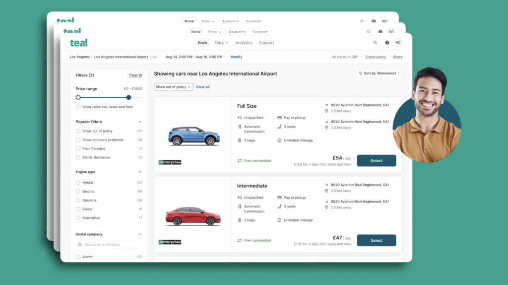
An additional constraint shaped the overall approach: the product was still in development, and some features could not be shown with finalized UI. The motion design needed to communicate real product value without relying on interface visuals that were not yet complete.
Motion Strategy
The piece was approached as a clarity challenge: how to communicate a complex product quickly, without finalized UI, across two distinct viewing contexts.
The solution was a two-track motion strategy:
• Attention + legibility for the trade show Bold typography, simplified staging, and high-contrast motion designed to read instantly in a high-noise setting.
• Comprehension for online viewers Deliberate pacing and structured sequencing to support narration and prevent cognitive overload.
Key Motion Decisions
• Visualizing complexity without clutter
Concepts such as policy control, budgets, safety, and technical coordination were represented through motion that conveyed complexity without sacrificing readability. Timing and easing were carefully tuned to balance emotional impact with clarity, ensuring information remained legible even in fast-paced sequences.
• Typography as the primary system
For benefits that were difficult to visualize, motion-driven typography was used to reinforce key messages and maintain momentum in both silent and narrated viewing contexts. Text motion provided a clear, scannable way to communicate value while keeping attention focused and reducing reliance on complex visuals.
• Designing around incomplete UI
Because the product was still in development, motion graphics were used to represent concepts that could not yet be shown through real UI. Abstract diagrams, spatial relationships, and metaphor-based animation communicated ideas such as global deployment and centralized control without relying on finished screens.
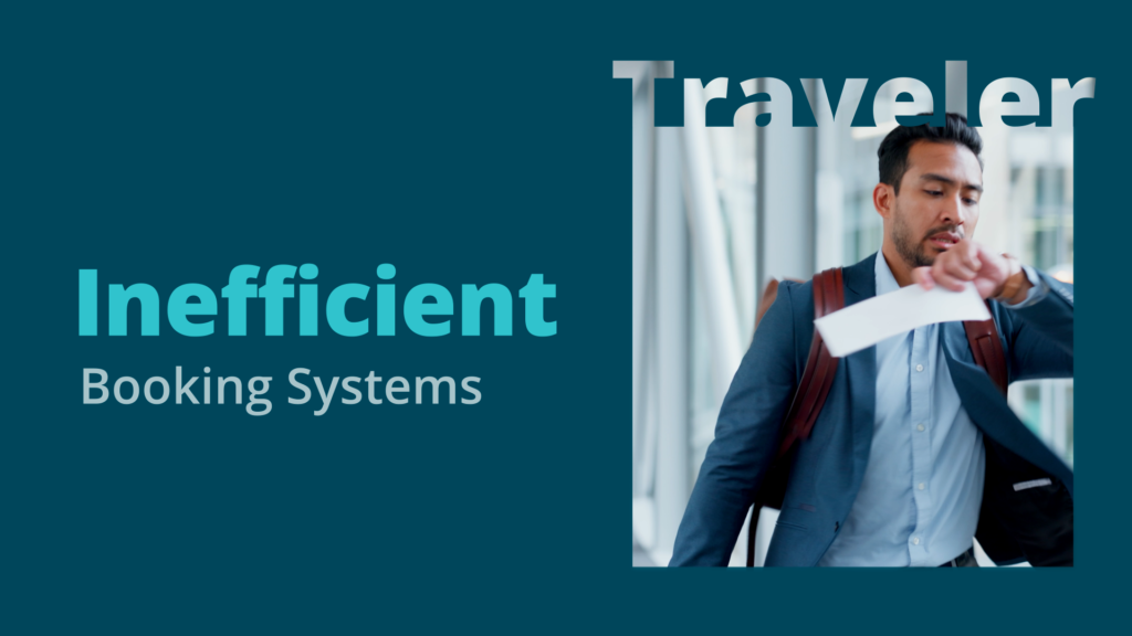
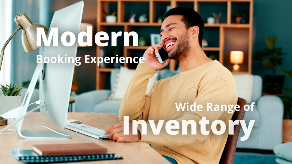
• Current state vs. future state contrast
Visual contrast was used to clearly differentiate existing pain points from the proposed solution. Stock footage was curated to show the same personas experiencing frustration in the current state and confidence in the future state, reinforcing the product’s value through emotional contrast.
• Brand alignment
The visual direction avoided traditional corporate aesthetics in favor of a more contemporary, human tone. Stock footage emphasized remote and hybrid work environments, aligning the video with how modern teams operate today.
• Call to Action Clarity
The video concludes with a clear, readable call to action, using motion to guide attention to JTB’s website and support easy follow-up after viewing.
Outcome
The explainer was successfully used at the BTSE trade show and received positive feedback from key stakeholders. Following the event, the video continued to be used as a marketing asset on JTB Business Travel’s YouTube channel, supporting ongoing product awareness beyond the launch.